By completing the research on the props it will allow me to decide on the props that I will use in my pop music magazine. The props will attract the attention of my target audience because many of them may play one of the musical instruments. The props are also everyday items and will help to show my target audience that the models/ band are normal people to.
 By completing this research on hair and make up it has allowed me to get an insight into what hair and make up is popular now, allowing me to create a better pop music magazine that will appeal to my target audience.
This is how I am going to set out my magazine. It is going to be a mix between Billboard and Top of the Pops. The name will be at the top with the strap line/motto underneath it. The title and the headline will be on top of the picture and the price under the name. The whole background will be one big picture of the pop star, like Billboard is set out. The barcode and issue number will also be on the front. These will include the main codes and conventions of a magazine.

This is how I am going to set out my contents page. There will be one big title and the page numbers will be down one side and what is on each page will be down the other side. It will be a simple page making it easy to navigate through the magazine. It will include all the codes and conventions of a magazine.
This is how I'm going to set out my double page spread. It will have one big title that will spread across the two pages. There will be two big pictures, one on each side, but the pages will be mostly text. This includes all the common conventions of a magazine.
I have looked at many different pop magazines and found that all the colour schemes are very similar, apart from Billboard. I have researched Top of the Pops, We Heart Pop and Billboard. I think that Billboard has a different colour scheme because it is aimed at an older audience. I want my pop magazine to be aimed at a similar age group to Billboard so therefore I will use a similar colour scheme to that. I have decided to use mostly blues, purples and yellows so it can be aimed at both male and female. This will meet the same target audience as Billboard, which is late teens to early 20’s male and female.
I have come up with lots of different titles that are all about pop stars. There is a variety of different topics that could all be linked to a pop magazine. I have chosen these based on research of other pop magazines and what they have on their magazine covers.
I have decided to use both "Best friends release single!" and "New Christmas number 1?". Both of these titles have very different stories that can go with them and could both be linked together.
These are the three different styles I have chosen to create my mood board for the Sub-heading font for my pop magazine. Two of the styles are very similar and the other one is similar to the title font. They are Yerbaluisa, Desert Queen and Hello Casual. I found these fonts on DaFont. I like these fonts because they all link to the theme of pop magazines.


I have decided to use the font Hello Casual as it is the closest font to the font I chose for the title. This means that there is a variation between them, but there is a theme going through the pop magazine. I decided to see what it looked like with the magazine motto written in that style and I thought that this one looked best.
I began researching different fonts by first looking at what fonts are already used on existing pop music magazines. I found that many of these suggested that it was a pop imagine even if the writing didn't. This is what made the pop magazine Billboard stand out most. I have decided to use fonts that will make my pp magazine easily identifiable as a pop magazine and that will also make people remember it.
 This is my mood board of different font styles for the name of my magazine. I chose these ten different fonts because they were a huge variety of fonts and styles that I thought could give my magazine a different feel to it. I found these fonts on the website DaFont.

 I have decided between two different fonts from my mood board was these are the ones I liked the most and thought would most appeal to my target audience. Both fonts are unique and give the magazine a happy feel to it. They would both make it stand out from other magazines and make it memorable.
I have decide to use the font cookies and milk (the first one) for the name of my magazine as I thought that this would best link to the pop magazine and would appeal to my target audience. I also thought that this would be the easiest font to read and stand out from the rest of the magazines and other pop magazines. This would catch the eye of my target audience and will be easily recognisable as no other magazine has font like that in it.

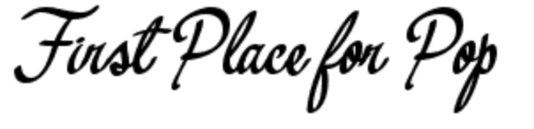
This is what my font looks like with the name of my magazine.
This is my mind map of name ideas for my magazine. I have decided that I want my magazines name to include the word pop in it to clearly show what genre of music it is. I have decided between the three names #Pop, All about Pop and Pop Monthly. I have decided to use the name Pop Monthly to clearly show what genre it is and when the magazine comes out in shops. Pop Monthly combines both these things and is an appealing name to my target audience.
I thought the name '#Pop' had a younger feel to it and the audience would associate it with a pop music magazine for a younger target audience. I also think that the name 'All About Pop' also had a younger feel to it.
This is my flat plan for my contents page of the school magazine. All the codes and conventions are the same as any magazine, as the page numbers are down one side and the name of each page is down the other side. There is also the name of the page at the top to tell people that it is the contents page and the logo in the corner to remind people what school it is from. I put pictures along the bottom so there is visual information as well as written and a box to put writing in to either explain what is in the pictures or if there is something special in that issue then it can be written in there.

This is our attempt at creating a contents page for a magazine. We decided to keep the same theme and use one picture as the background. We chose a brightly coloured picture of one students artwork as this stood out the most. Mise en scene shows us that brightly coloured photos give people a feeling of happiness and this is what we wanted people to feel when they are reading our magazine. We kept the Astley Cooper logo in the same place on the page to remind people what school the magazine is for and by keeping it in the same place it linked the two pages together and made them look similar. The contents page isn't set out the same as most contents pages from magazines as it is quite simple. This means that it is easy to read and use. It still includes all the codes and conventions of a magazine contents page though. We made it clear to read by putting the page numbers down one side and the names of the pages down the other. This means that it is easy for people to navigate their way through the magazine.
Part of the preliminary task we were given was to make a school magazine front cover. We chose to use a picture as the whole background rather than lots of little pictures. This was because we felt that one big picture of a signpost showing where each department in the school was represented the school better than lots of little pictures and showed a variety of places in the school. We put the Astley Cooper logo in the corner to show what school the picture was from and what school the magazine is about. We also included the school motto on the front to help to promote the school and the date to show when we made it. We put the price and the barcode on it as well as these are two common conventions of magazines.
This is a mind map of the codes and conventions that are used in a pop magazine. These codes and conventions are often used in all magazines but some are specific to pop magazines.
When researching different pop magazines i have found that these are the codes and conventions that come up in eery magazine, so this is what people want to see when they buy a pop magazine. I will therefore include these things when making my pop magazine.
The things that always come up in pop magazines are: Large Headlines, Date, Barcode on the front, Tag line, Main Image, Informal Language, Happy Mood, Issue Number, Quotes and Bright Colours.
These codes and conventions are influenced by the target audience of pop music magazines.
By looking at different pop magazine I have noticed that they differ slightly depending on what age or gender they are aimed at. For example top of the pops is very pink so is aimed more at teenage girls whereas Billboard is less pink and in your face and is aimed more at both genders but older people. The interviews in this are aimed more at older people and use older language than top of the pops and we heart pop.
This task has helped me to gain a better understanding of what is needed in a pop music magazine to help me to make a good quality product.
By researching different music magazines I created my flat plan. I included all the codes and conventions of magazines in the front cover. These codes and conventions are: Name, Title, Writing, Picture, Barcode, Date, Issue Number and Price.
I found that the most important thing is the title, the writing and the picture. These are the things that advertise and show the school most. I thought that including the school motto in the writing would advertise it better.
 I have noticed that double page spread are usually mostly taken up by a picture. This picture is usually on one o the pages with the writing on the other but some magazines have the picture over two pages with the writing around it. All the images are unique to the story and include pictures relate to what is being talked about. I will consider this when making my magazine and use pictures and writing in the same way.
 I have noticed that contents pages tend to feature the front cover of the magazine on them with labelling of what is on which page. Many magazines include this but some just put a picture. It is mostly writing in the contents page but it is only a few lines and instructions on what page to go to for each article. I am going to apply this information to my magazine when I create it.

This is a mood board of front covers of pop magazines. When looking at the magazine front covers it has given me ideas as to what pop magazines look like an how they are laid out. This also gives me an idea of what the colour schemes are, as most of these magazines are similar colour and design. I have learnt that front cover images range from close up shots t medium shots and often include more than one person. They feature light colour schemes using most pinks, yellows and reds.


 I have decided between two different fonts from my mood board was these are the ones I liked the most and thought would most appeal to my target audience. Both fonts are unique and give the magazine a happy feel to it. They would both make it stand out from other magazines and make it memorable.


